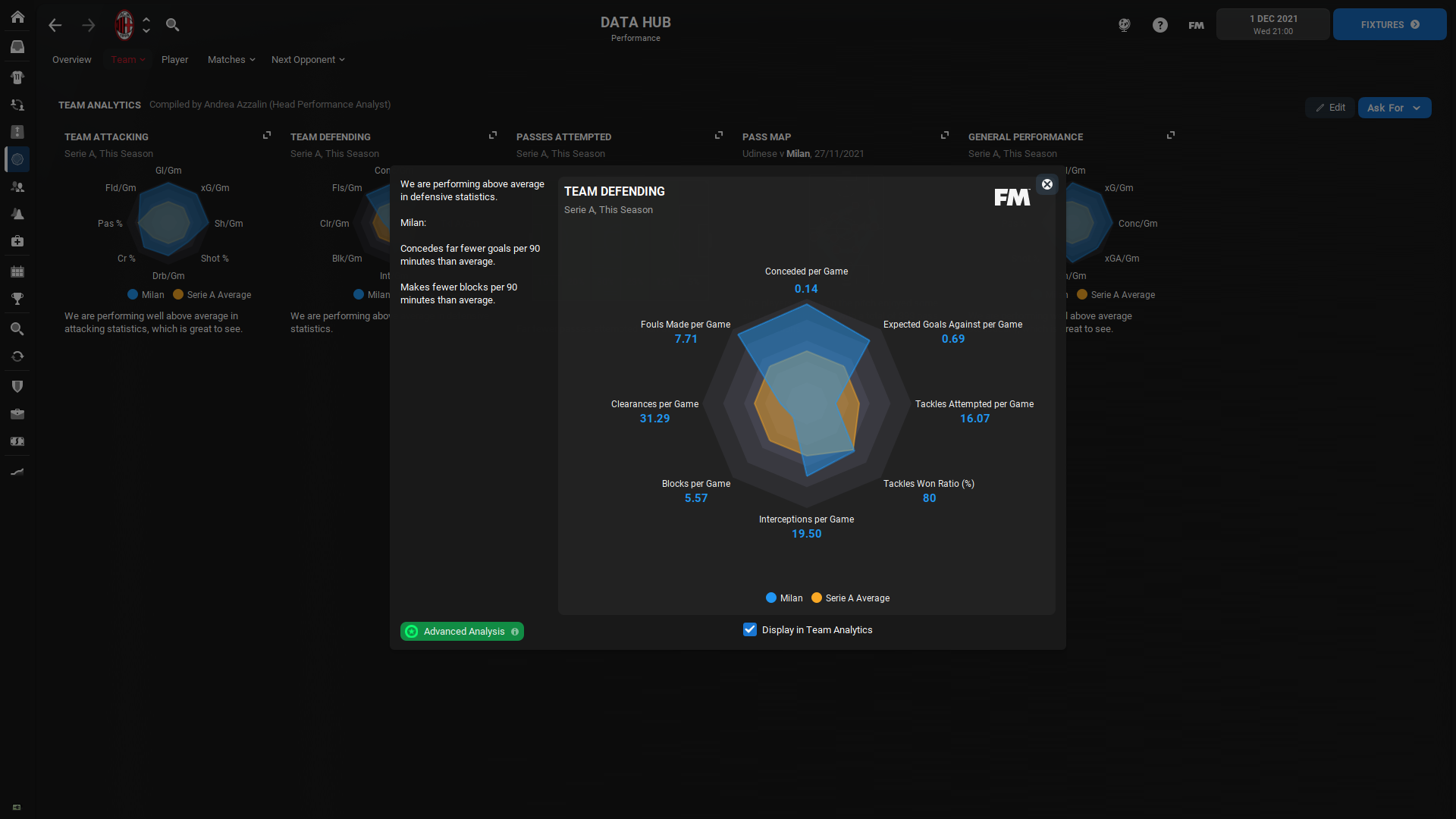
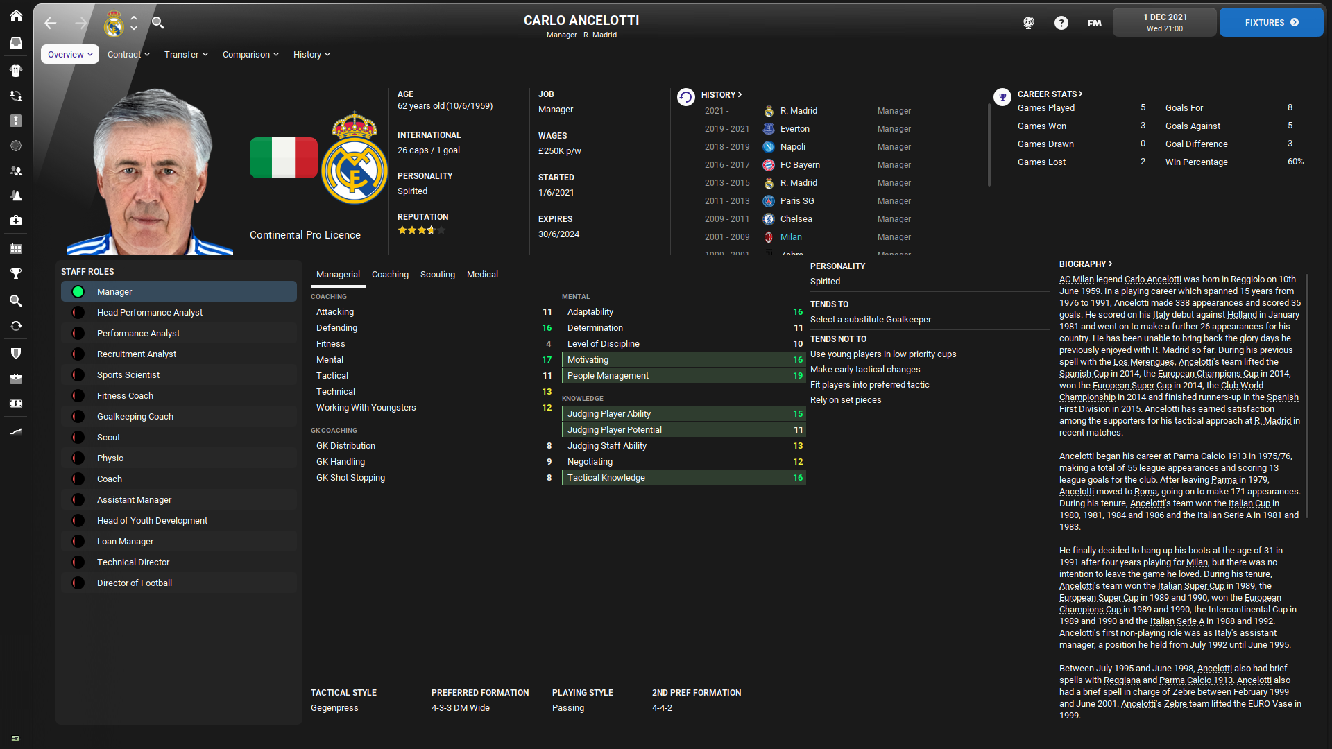
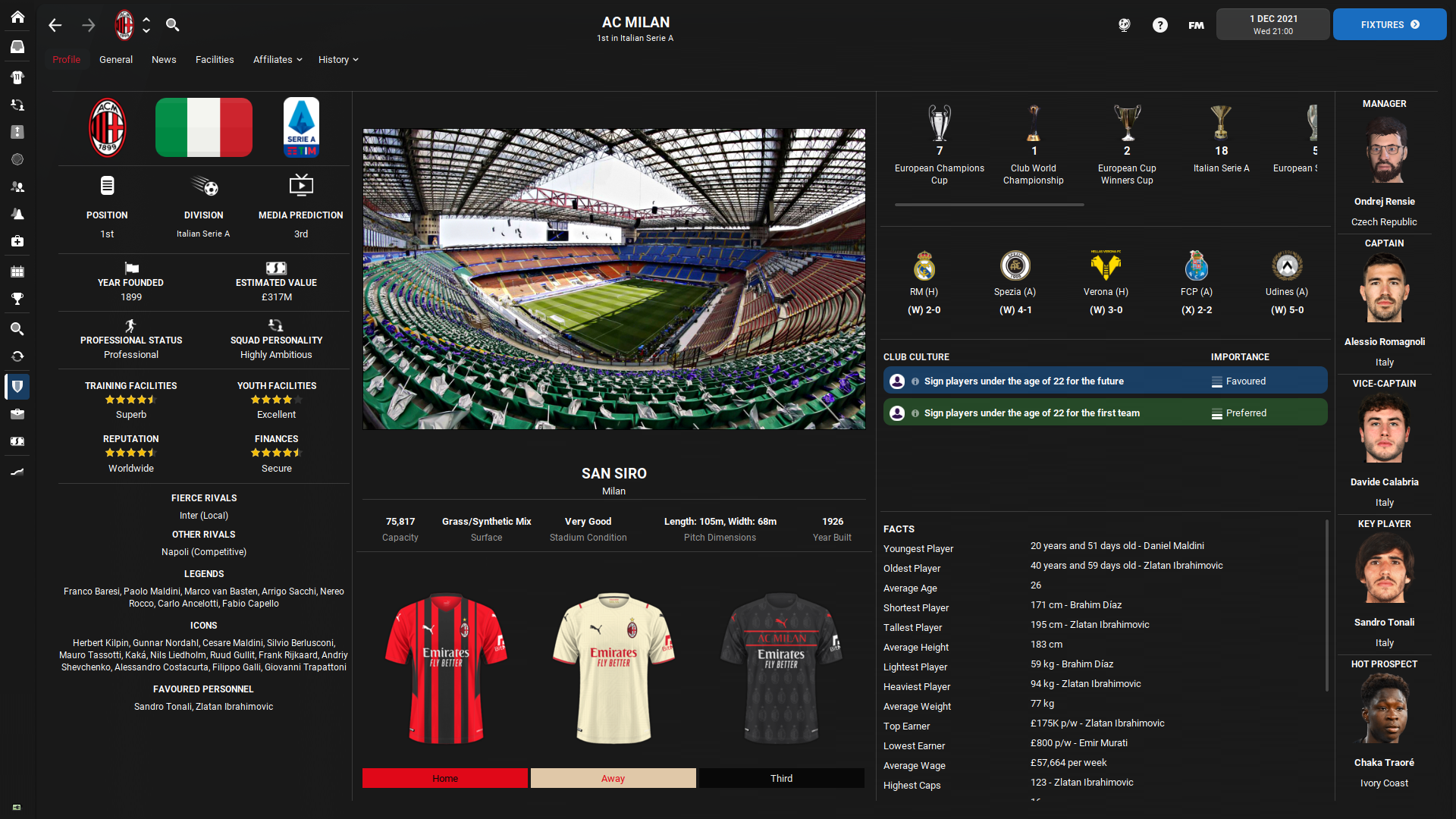
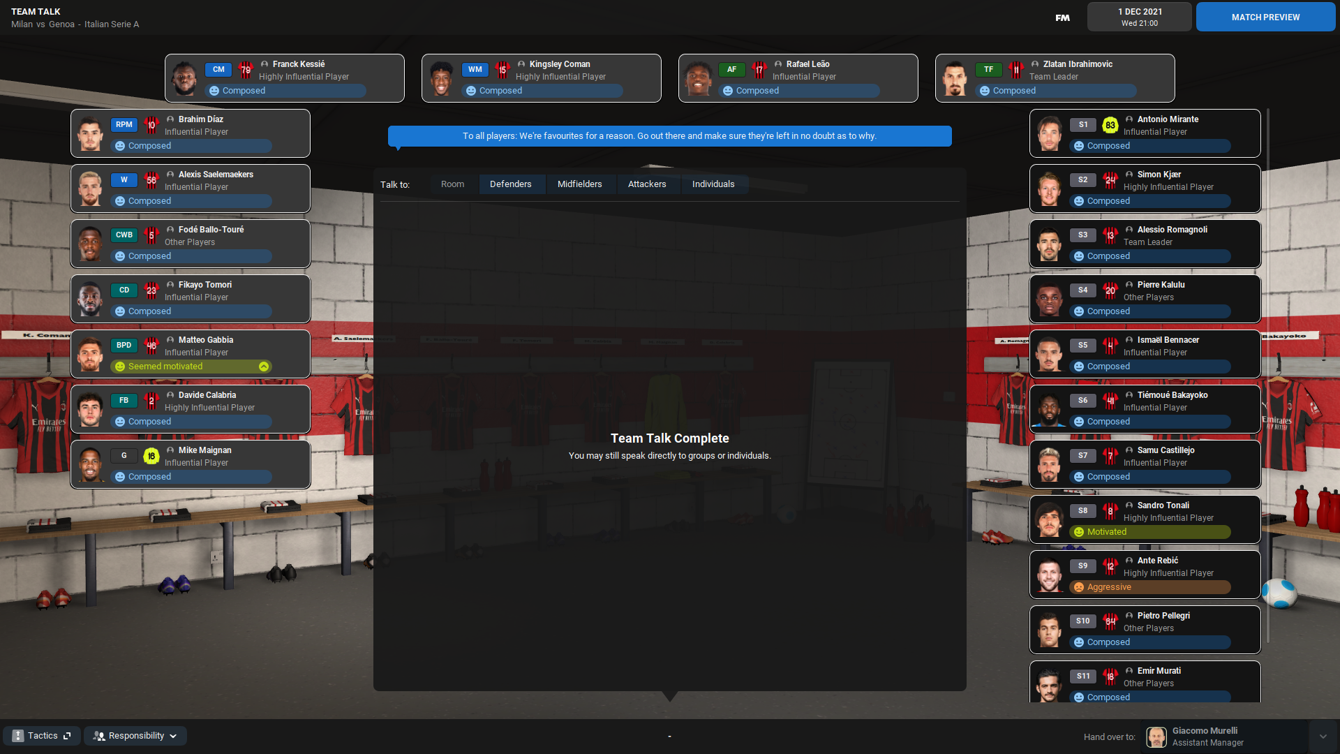
The Football Manager 2022 offers one default skin. That means it was easier to finish my custom skin because I didn’t have to make both dark and purple versions. The default purple colour is even lighter in FM22 and despite I have almost nothing against it, I was sure I will remove it. Or I will try to remove most of this colour.
I spent a lot of time in the settings file of this custom skin but also within many panels, widgets or graphic boxes and buttons to make it in the way I like it.
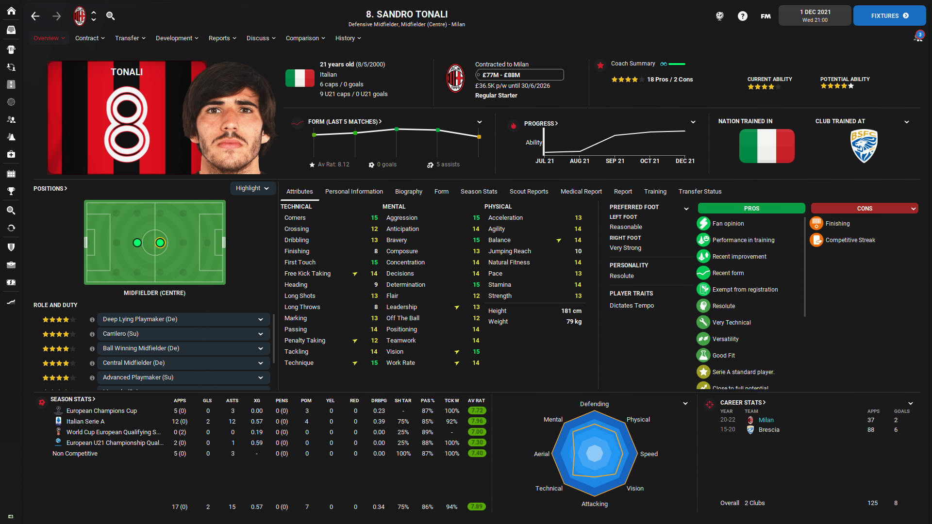
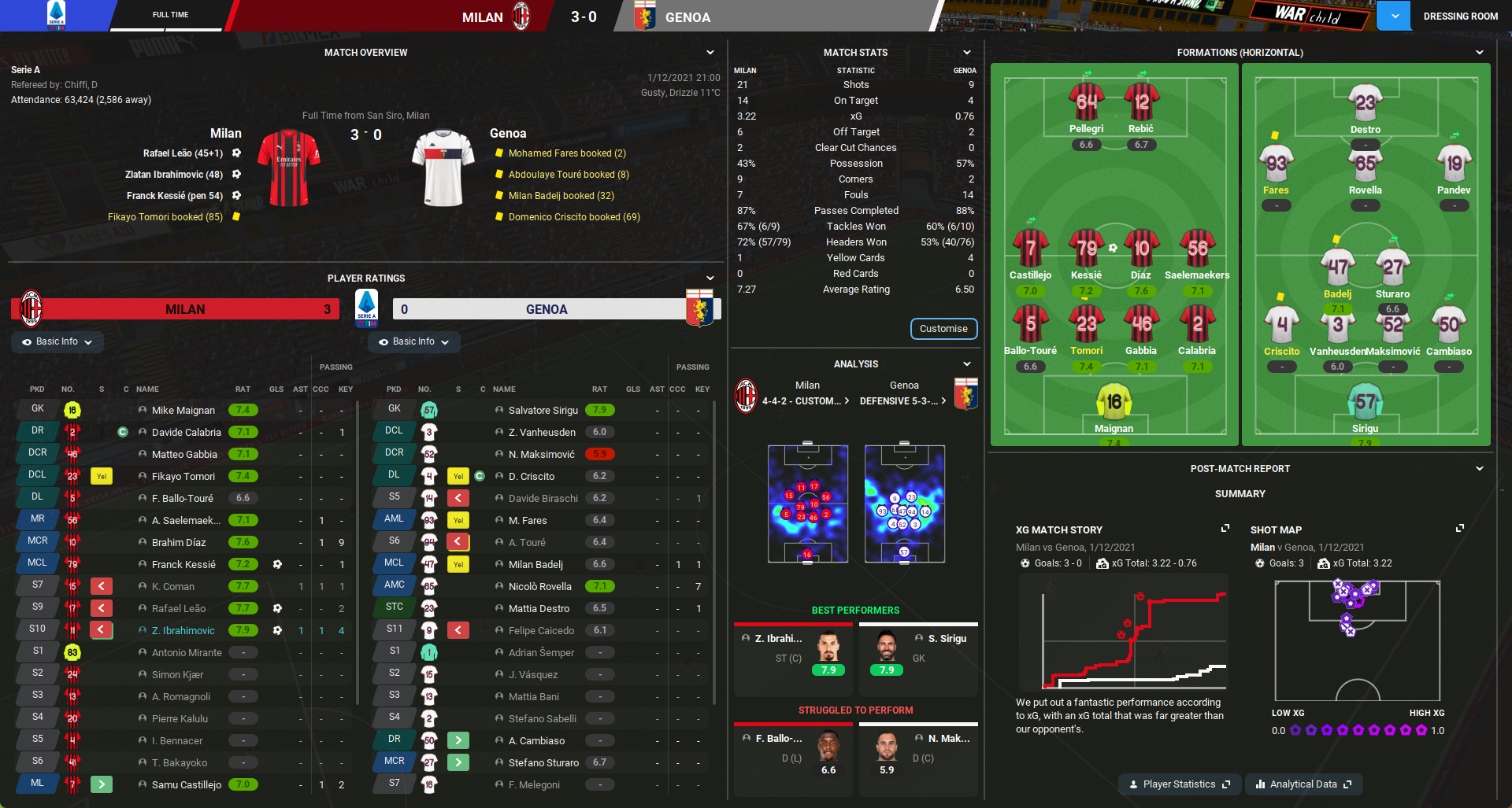
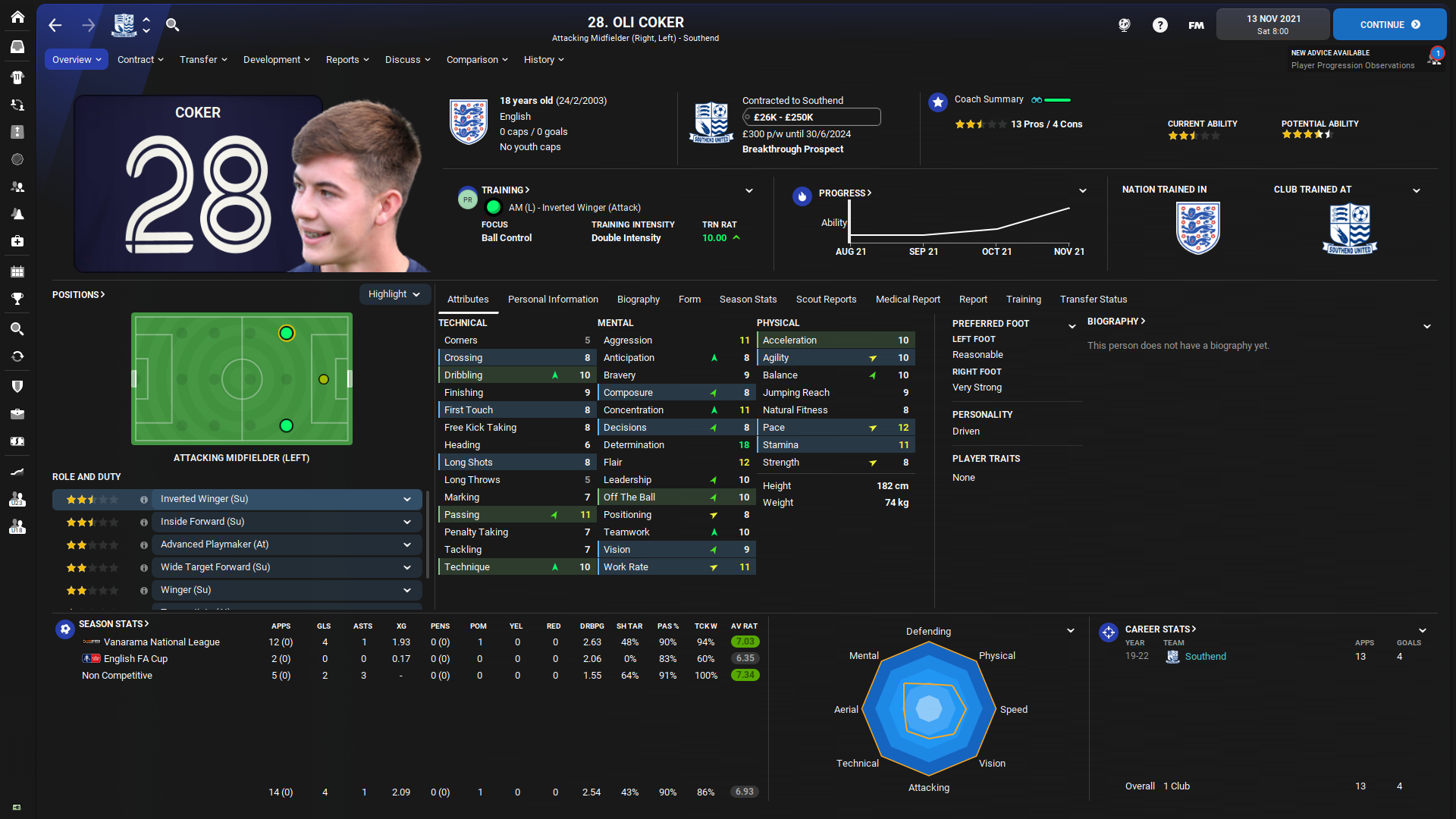
The result is available to download now. Both ‘normal’ and low-resolution versions have something in common. It’s a combination of dark and blue colours. The ‘blue 700’ shade replaced most of the bright purple colour in headlines, boxes, buttons, speeches or even in the intro box at the FM start screen when you load the game.
I was always a fan of this kind of blue colour and it was an easy choice for me to combine it together for the FM22 skin. It’s probably not a coincidence that all the clubs I played with between FM17 and FM21 have blue colour as primary or secondary. It’s a little thing but check the calendar screen for example where I added the blue colour as the main colour of the calendar cell. It’s like I went back to my childhood when I finally found what I wanted to edit. The popup calendar and the background of the today box is a great example.
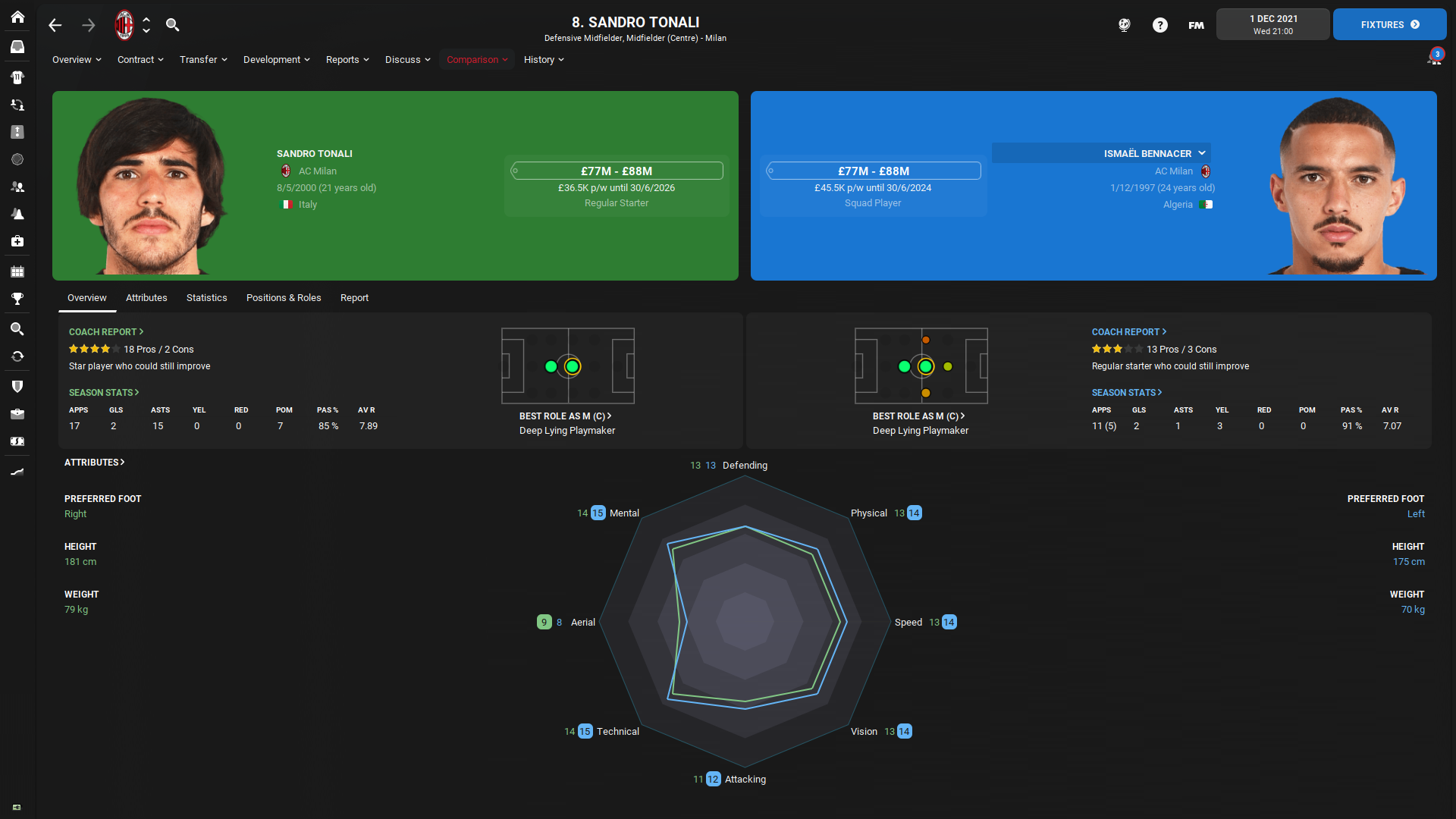
I won’t share what everything is edited. I will be 100% clear to you - if I don’t count the main things like Player Overview or Club Overview, I don’t remember all the small tweaks and changes I made during last year. But I’m very glad I made or tweaked most of the things by myself and not only copied/paste them from different skin.
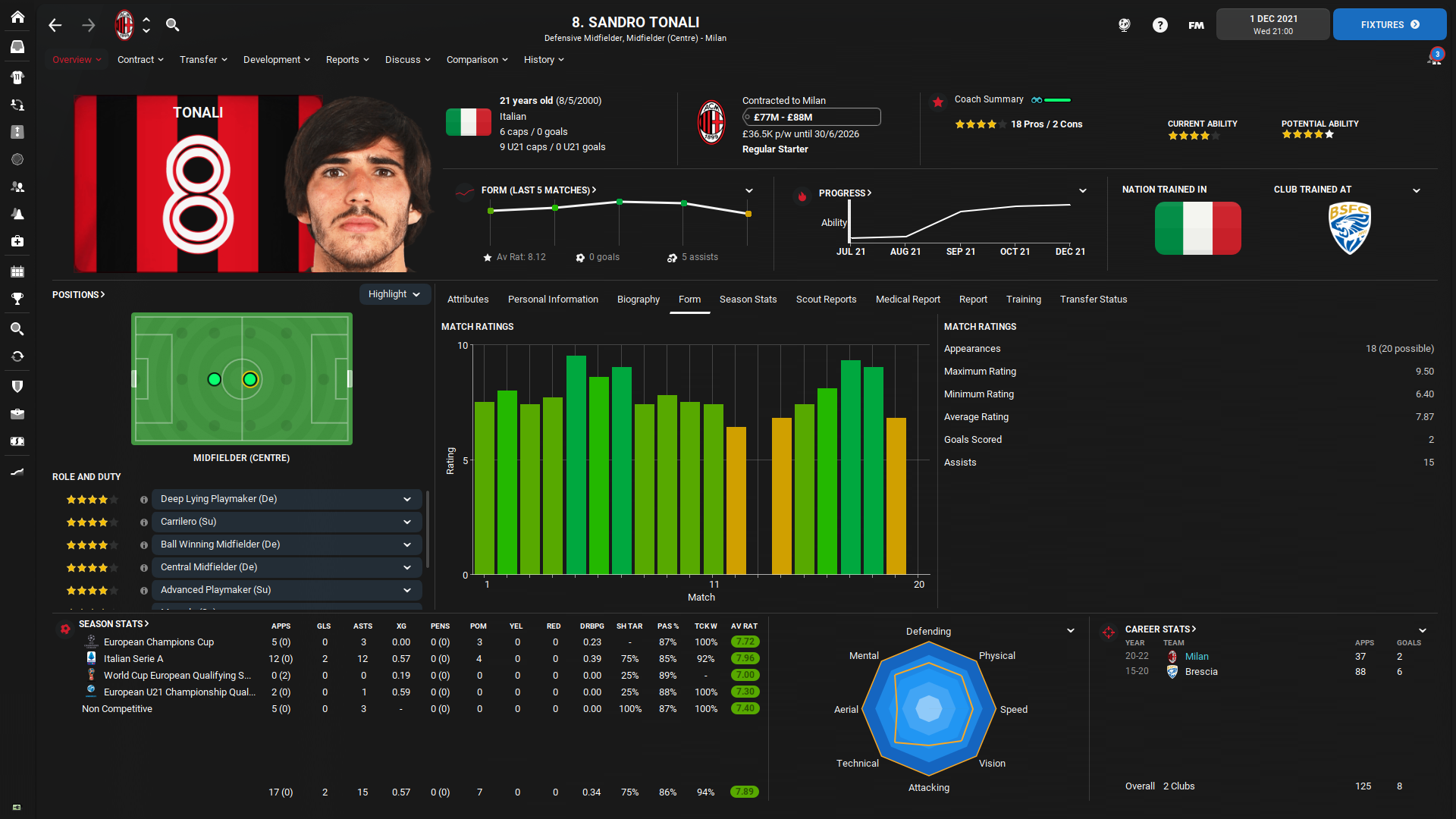
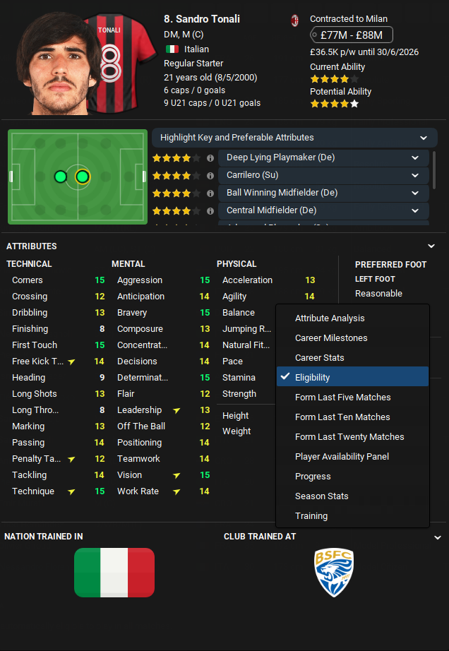
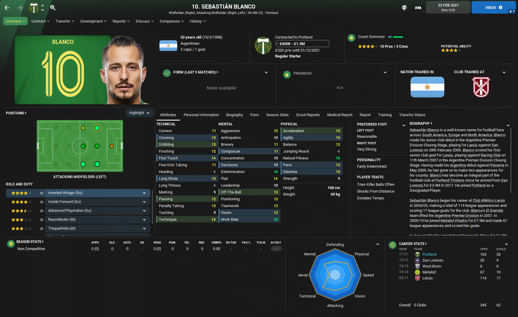
If I’m proud of something, it really is the Player Popup Profile including the player details in the upper part and the widgets selector in the bottom part where you can find the Form in the last 5, 10 or 20 matches of the specific player. Btw. these widgets are also in the normal player profile.
The FM21 skin included the selector within the player profile and I kept it for the FM22 as well because I like it and it works really well if you get used to it. There are many things and you can check the gallery or try the skin. You can always revert it back to the default or use someone else's work.
This skin version is the version I edited almost the whole calendar year through FM21 and the beta version of FM22 whenever I had some time. That means it’s also my own version and I would not share something that I would not use by myself.
Gallery
Q&A
What resolution is this skin created for?
I’m using the most common 1920x1080 resolution with 100% zoom. The skin works with the Full Mode and Windowed as well. If you play in Windowed mode, the screen will be a little bit lower in height logically but I tested the skin in both Full and Windowed mode to ensure widgets and panels don’t move wrongly.
Does the skin include the Instant Result button?
Yes, it’s easier to add this button than to answer all questions about why it’s not in the game.
I don’t see the stadium pictures on the club overview screen. Is it a bug?
No, it’s not a bug. You have to download the custom mini stadiums pack to make it work. I’m using THIS ONE. And you can always add your own picture and edit the config file to have 1) a different picture or 2) a picture of your new stadium.
Why there are no logos and faces as in your pictures?
The same as above, you have to download the graphic add-ons on sites like sortioutsi.net, fmscout.com, fmslovakia.com etc. The skin doesn’t contain graphic add-ons, it would be too big a file.
Why do the panels in the home screen or player overview reset?
Untick the “Automatically override custom panels” in the Preferences.
No last starting XI widget in the club overview?!?
Great spot. The widget stopped working properly on this screen, it works somewhere else respectively as Wozzie told me. But I added the club culture and facts widgets to the club overview and tweaked this screen a little bit and I liked it more in this way. The club culture and facts widget gives me more useful information than the pitch with the last starting XI.
The downloaded file is in ‘.fmf’ format. What to do with it?
Just place it to the skin folder, it works absolutely the same as the packed folder before.
Why you didn't release the beta version with 2352423 updates for two weeks?
Because I'm not a crazy madman...
I like one panel in the skin by Wozzie and two panels in the skin by FMEnhanced. Will you add everything to your skin for me?
I’m very grateful for every feedback and I will always try to repair if something in the skin doesn’t work properly. But no, I won’t update the skin just because someone likes something different. I’m not a skinning expert and I’m doing mainly basic things because I like it in this way. Skins created by Wozzie, FMEnhanced, FMwkdsoul or Wannachupbrew are more detailed and more sophisticated and they always are because these creators are the best. There is always a lot of options. And if you would like to learn something about skinning, just go to the SI Forum/Skinning Hideout, there are always people who are willing to help in the lead with Michael Murray or ‘bluestillidie00’.
UPDATE November 18, 2021:
Fixed buttons in the scouting card
Reduced the half-time match screen to two slots instead of three
Added quick tactics buttons including Formation, mentality, shouts, make a substitution, team instructions and opposition instructions
Added player faces to the player’s bar during the match and increase the size of the bar to the full width of the screen.
Added the 'back' arrow back to the match team talk bottom line to be able to return from the team talk to the mid-match summary
Team names aligned to the centre of the match score widget(s)
Edited the view in the List tab in the Scouting Centre to use the full width and added columns like contract expiry or transfer status
UPDATE December 20, 2021:
Player scout report panel fixed
Added properties.xml to allow adding more columns within custom views
Added the good old timeline to the ‘live’ match coverage.
Credits & thanks
michaeltmurrayuk for his Match Screens from FM21 as I edited small parts to adapt it. And his help within the SI Forum, not only for my issues.
Gaz / FMwkdsoul for his idea of the selector in the player overview screen as I saw it in screens from his skins on Twitter and decided to make it by myself before FM21.
Wozzie for the help with the player bottom bar and the “i” icon during the FM21, it’s still one of the best things of all.
bluestillidie00 as he is always able to help in the skinning hideout of the SI Forum.
How to install:
If you’re in the game just quit the game to eliminate crashes or issues with the game.
Download the skin.
Move the “FM22 Rensie Skin.fmf” file to your skins folder: Documents/Sports Interactive/Football Manager 2022/skins.
Run Football Manager 2022, go to Preferences and select “FM22 Rensie Skin” on the Overview screen or in the Interface tab.
IMPORTANT: You’re not allowed to repost the skin to your own website or your forum. Thanks for understanding and respecting this.
If you think this work deserves some donation to my PayPal account, you are free to send some money via this link – paypal.me/fmrensie.
The money from FM20 and FM21 were used not for my own but I sent them to the food bank as I mentioned in this tweet.

